Color is one of the most powerful tools in an artist's arsenal. It can evoke emotions, create focus, establish harmony, and communicate meaning—often before the viewer has even processed the subject matter. Yet despite its importance, color theory remains a challenging subject for many artists. In this comprehensive guide, we'll explore the fundamentals of color theory and how you can apply them to elevate your artwork.
The Foundations of Color Theory
Before diving into complex color relationships and applications, let's establish a solid understanding of the basic components of color theory:
The Color Wheel
The color wheel is the visual organization of colors around a circle, showing the relationships between primary, secondary, and tertiary colors. The traditional RYB (red, yellow, blue) color wheel is commonly used in art, while the RGB (red, green, blue) and CMYK (cyan, magenta, yellow, black) models are used in digital design and printing respectively.
- Primary Colors: In the traditional color wheel, these are red, yellow, and blue—colors that cannot be created by mixing other colors.
- Secondary Colors: Created by mixing two primary colors: orange (red + yellow), green (yellow + blue), and purple (blue + red).
- Tertiary Colors: Created by mixing a primary and adjacent secondary color, such as red-orange or blue-green.

The traditional color wheel showing primary, secondary, and tertiary colors
Color Properties
Every color has three main properties that define its appearance:
- Hue: The pure color itself (red, blue, etc.) as it appears on the color wheel.
- Value: The lightness or darkness of a color. Adding white creates a tint, while adding black creates a shade.
- Saturation: The intensity or purity of a color. Highly saturated colors are vivid, while less saturated colors appear more gray or muted.
Understanding these properties allows artists to manipulate color with precision. For example, reducing the saturation of all colors in a composition can create a sophisticated, subdued mood, while varying the value creates depth and dimension.
Color Relationships and Harmonies
Creating effective color schemes relies on understanding how colors interact with each other. Here are the main color relationships that artists use to create harmonious compositions:
Complementary Colors
Colors positioned opposite each other on the color wheel, such as red and green, blue and orange, or yellow and purple. When placed side by side, complementary colors create maximum contrast and make each other appear more vibrant. This relationship creates energy and excitement but can be jarring if overused.
Application: Use complementary colors when you want elements to stand out dramatically. For example, a small area of orange against a predominantly blue painting will immediately draw the viewer's eye.
Analogous Colors
Colors that sit adjacent to each other on the color wheel, such as blue, blue-green, and green. Analogous color schemes create harmony and are pleasing to the eye because they occur frequently in nature.
Application: Use analogous colors when you want to create a sense of cohesion and tranquility. This harmony works well for landscapes, serene subjects, or when you want elements to blend together seamlessly.

An example of an analogous color scheme in a landscape painting
Triadic Colors
Three colors equally spaced around the color wheel, such as red, yellow, and blue. Triadic color schemes are vibrant and balanced, offering strong visual contrast while maintaining harmony.
Application: Use triadic colors when you want a vibrant composition that feels balanced rather than overwhelming. This scheme works well for bold, dynamic artworks.
Split-Complementary Colors
A variation of the complementary scheme, this uses a base color and the two colors adjacent to its complement. For example, blue with yellow-orange and red-orange. This provides high contrast with less tension than complementary schemes.
Application: Use split-complementary when you want contrast without the intensity of direct complementary colors. It's more sophisticated and easier to balance.
Monochromatic Colors
Different tints, tones, and shades of a single hue. Monochromatic schemes are cohesive and elegant, creating a sense of unity throughout the composition.
Application: Use monochromatic schemes when you want to explore the subtle variations within a single color, or when you want to create a sense of calm and cohesion. This approach allows you to focus on value and form without the complexity of multiple hues.
Color Psychology and Symbolism
Colors carry psychological associations and symbolic meanings that can significantly impact how viewers interpret your work. While these associations can vary across cultures, here are some common psychological effects of colors in Western contexts:
Red
Associated with passion, energy, danger, and power. Red draws attention and creates a sense of urgency. It can raise blood pressure and stimulate appetite, which is why it's often used in restaurant branding.
Blue
Evokes feelings of calm, trust, and reliability. Blue has a soothing effect and is associated with depth, stability, and professionalism. Lighter blues feel refreshing, while darker blues convey more authority.
Yellow
Represents optimism, clarity, and warmth. Yellow captures attention and creates feelings of happiness and energy. However, excessive yellow can cause anxiety or fatigue.
Green
Symbolizes growth, harmony, and nature. Green has a balancing, refreshing effect and is associated with health, prosperity, and environmental consciousness.
Purple
Connected to creativity, royalty, and spirituality. Purple combines the energy of red with the calm of blue, creating a sense of mystery and luxury.
Orange
Represents enthusiasm, creativity, and determination. Orange is stimulating and conveys energy without the aggressiveness of red.
Black
Associated with sophistication, power, and formality. Black creates drama and contrast, and can convey elegance or mystery depending on the context.
White
Symbolizes purity, simplicity, and cleanliness. White creates a sense of space and possibility but can feel sterile or cold without warming elements.

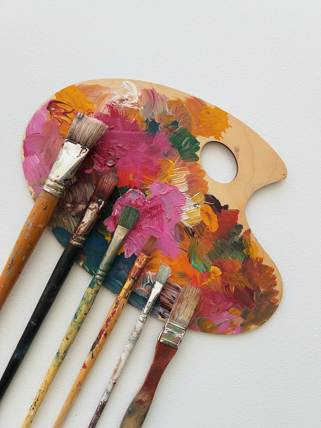
Colors evoke different emotional responses and can dramatically affect the mood of an artwork
By understanding these psychological effects, you can strategically use color to enhance the emotional impact of your work and guide the viewer's experience.
Practical Color Applications in Art
Now that we've covered the theoretical foundations, let's explore how to apply color theory in practical ways:
Creating Focal Points
The strategic use of color can direct the viewer's attention to specific areas of your composition. Here are effective techniques:
- Contrast: Areas with the highest contrast (whether in hue, value, or saturation) naturally draw the eye. Place your highest contrast at your focal point.
- Isolation: A small area of color that differs from the dominant palette will stand out dramatically.
- Saturation: More saturated colors appear to advance and grab attention, while muted colors recede.
Creating Depth and Atmosphere
Color can create a convincing sense of three-dimensional space on a flat surface:
- Atmospheric Perspective: Colors become cooler, lighter, and less saturated as they recede into the distance. This mimics the effect of atmosphere in landscapes.
- Warm/Cool Contrast: Warm colors (reds, oranges, yellows) appear to advance, while cool colors (blues, greens, purples) recede, creating natural depth.
- Value Contrast: Stronger value contrasts in the foreground transitioning to lower contrast in the background enhances the illusion of depth.
Creating Mood and Atmosphere
Color temperature dramatically affects the emotional quality of your artwork:
- Warm-Dominant Schemes: Create feelings of energy, comfort, or intensity. Think of sunset scenes or cozy interiors.
- Cool-Dominant Schemes: Evoke calm, melancholy, or clinical detachment. Moonlit scenes and winter landscapes often use cool schemes.
- Limited Palettes: Using a restricted range of colors creates unity and often results in more sophisticated, harmonious work.
Color Mixing Essentials
Effective color mixing is crucial for achieving the specific hues you envision:
- Understanding Bias: Most pigments have a bias toward secondary colors. For example, a "primary blue" might lean toward green or purple. Knowing these biases helps predict mixing results.
- Mixing Complements: Combining complementary colors in varying proportions creates sophisticated neutrals (not just muddy browns).
- Temperature Control: Maintain awareness of whether you're making a color warmer or cooler with each mixing decision.
Advanced Color Concepts
As you become more comfortable with basic color theory, these advanced concepts can take your work to the next level:
Simultaneous Contrast
Colors influence how we perceive adjacent colors. When two colors are placed side by side, the difference between them is heightened. For example, a neutral gray will appear cooler when surrounded by warm colors and warmer when surrounded by cool colors. Understanding this effect allows you to create vibrant, dynamic color relationships.
Color Harmony Through Discord
Deliberately breaking color harmony in small, strategic ways can create interest and tension. Consider introducing a controlled "discord" color that breaks your scheme but serves a compositional purpose.
Subtractive Color Mixing
In traditional media, colors become darker and less saturated as you mix them (unlike additive mixing in digital environments, where colors become brighter). Understanding this principle helps you maintain color vibrancy by using fewer pigments in your mixtures.

Advanced color techniques like simultaneous contrast create dynamic visual effects
Practical Exercises to Improve Your Color Skills
Color mastery comes through deliberate practice. Here are exercises to develop your color sensitivity and decision-making:
Color Matching Challenge
Select an object or area in your environment and try to mix its exact color. This teaches you to see subtle temperature and value shifts within what appears to be a single color.
Limited Palette Studies
Create a painting using only three colors plus white. This constraint forces you to understand color relationships and mixing properties deeply. Try different primary triads to see how they affect your range of possibilities.
Color Scheme Studies
Take a simple subject and paint it multiple times using different color harmonies (complementary, analogous, triadic, etc.). Notice how each scheme changes the mood and impact of the same subject.
Grayscale to Color Translation
Paint a subject in grayscale first, focusing solely on value relationships. Then create a color version, maintaining the same value structure but adding hue and saturation. This helps you separate value decisions from color decisions.
Conclusion: Developing Your Color Confidence
Color theory might seem overwhelming at first, but like any aspect of art, it becomes intuitive with practice and conscious application. Remember these key principles as you develop your color confidence:
- Observation is key: Study how color works in both art and nature. Notice how light affects color, how colors interact, and how master artists use color to achieve specific effects.
- Theory informs intuition: Understanding color theory doesn't mean rigidly following rules. Rather, it gives you a framework for making intentional choices that eventually become intuitive.
- Consistency builds recognition: As you develop your personal approach to color, consistent color choices can become part of your unique artistic voice.
- Keep experimenting: Some of the most exciting color discoveries come from playful experimentation. Don't be afraid to break "rules" once you understand them.
Color is a language with infinite expressive possibilities. By mastering its vocabulary and grammar through theory, and then finding your own dialect through practice, you can communicate with remarkable nuance and impact in your artwork. Whether you're working in traditional media or digital formats, thoughtful color use will elevate every aspect of your creative practice.